Case Study



Logos
When asked about the things Alwynds wanted to incorporate into the visual side of their brand the key concepts were ‘looking forward,’ and ‘stability/security.’ Early on it was decided I’d use the logo mark (or icon) to represent the first concept, and the logotype (or word mark) to represent the second.
The logo mark is made up of a ‘sun’ as the backdrop, and a winding road that symbolizes the way forward. The road can also be interpreted as a stylized lower case or capital ‘a’ to represent Alwynds. The logo type is a custom typeface with solid, upright, upper case letterforms that offer a rigid (or stable) contrast to the more flowing logo mark.

Digital
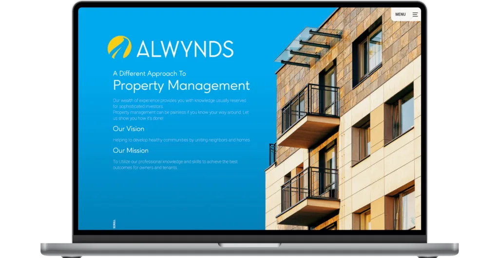
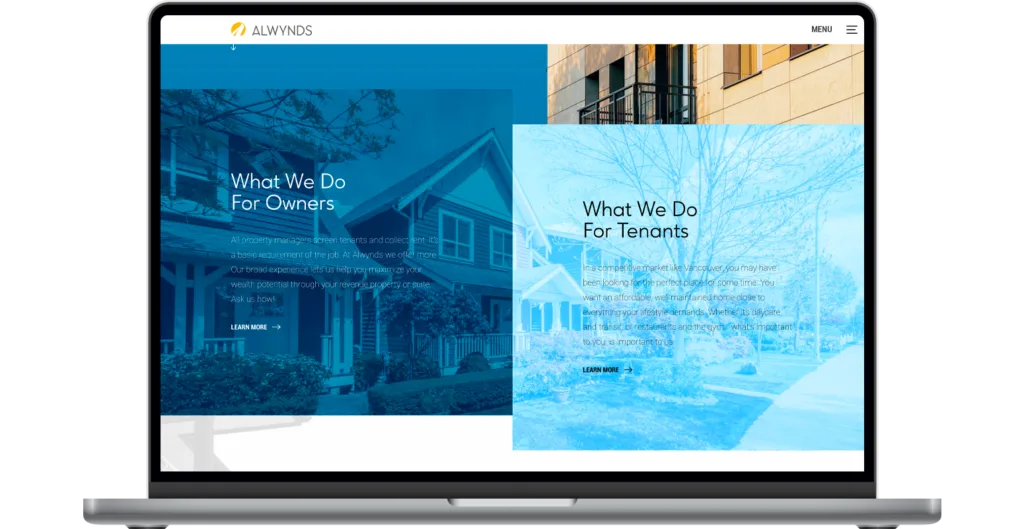
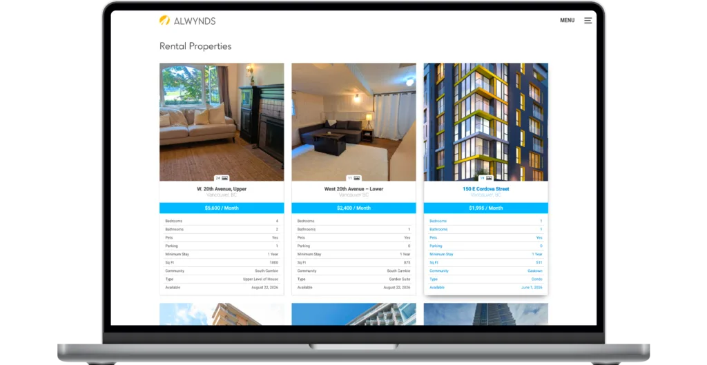
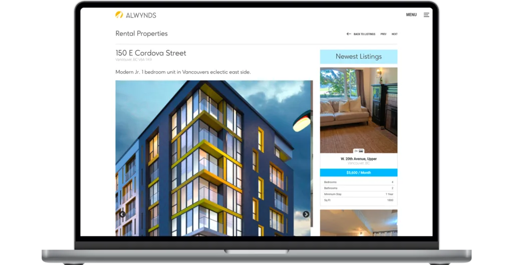
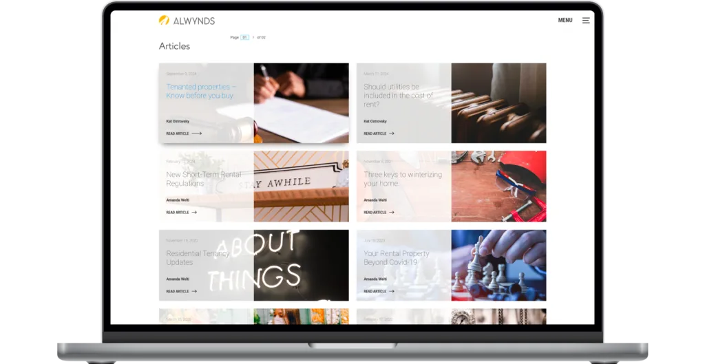
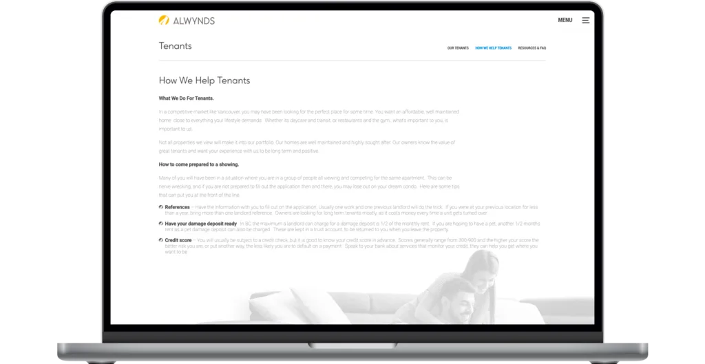
The design style of the Alwynds website captures the culture and lifestyle of Western Canada; both important elements in property management considerations. Simplicity was the core concept on which the site was designed. Users are ushered through an experience that quickly directs them to the information they desire. Visitors are presented with critical property listing data, informative articles, various resources, and a clear explanation of its services.

Print Marketing
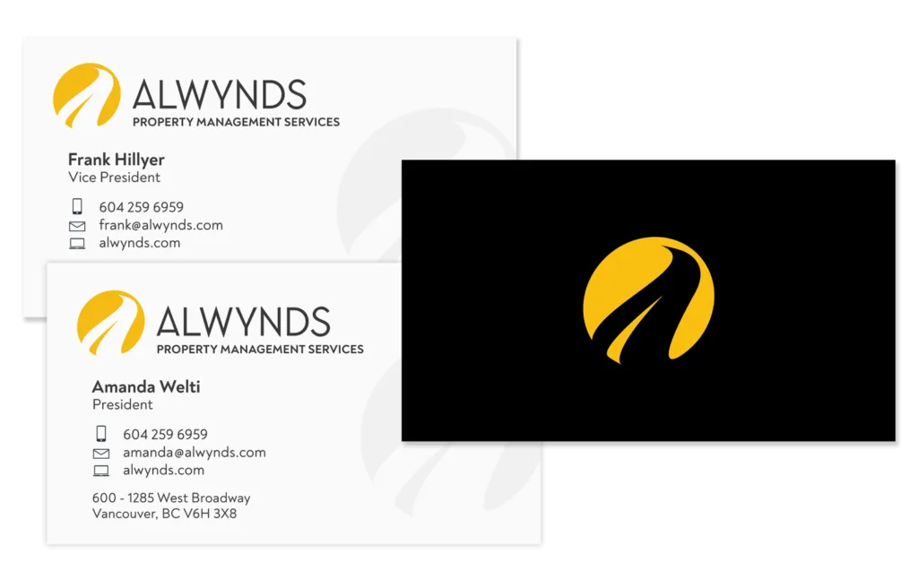
Nothing on a screen can capture the impact of a well produced print piece. These cards are no exception. The final printed product uses a gold foil where the yellow logo mark appears, and the faded grey logo marks aren’t actually grey, but rather indicate where only a spot gloss was applied. The varnish catches the light and adds a sense of depth to these cards.