Case Study



Logo
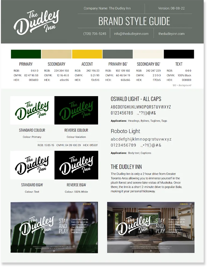
After being inspired by a number of different current and past Canadian brands, it was decided a traditional looking script would best suit for The Dudley Inn’s wordmark logo. The green colour is meant to represent the many conifer trees surrounding the property, and common throughout the Muskokas.

Digital
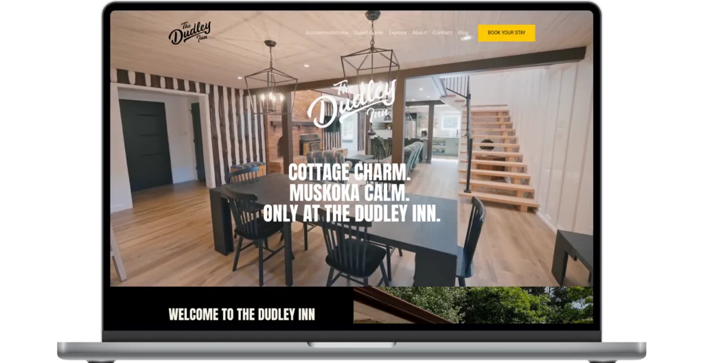
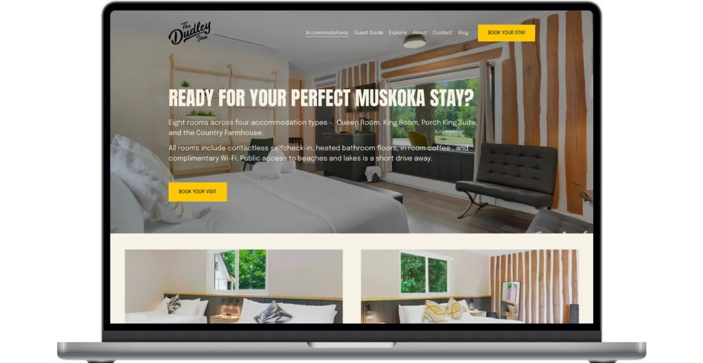
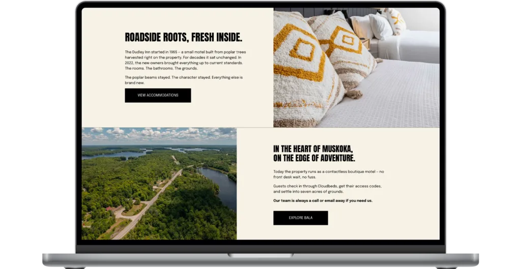
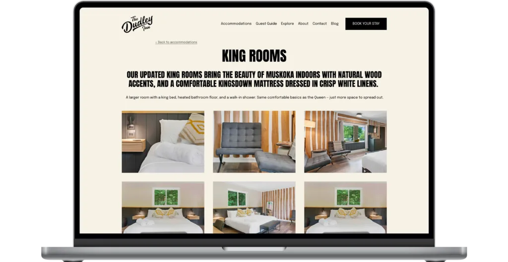
The Dudley Inn website takes site visitors on a tour of the rooms, a gallery of photos of the inn and the Muskoka area, News & Events, and more. The handsome website was integrated with the Cloudbeds third-party booking system, hosted separately.

In-Room Promotion
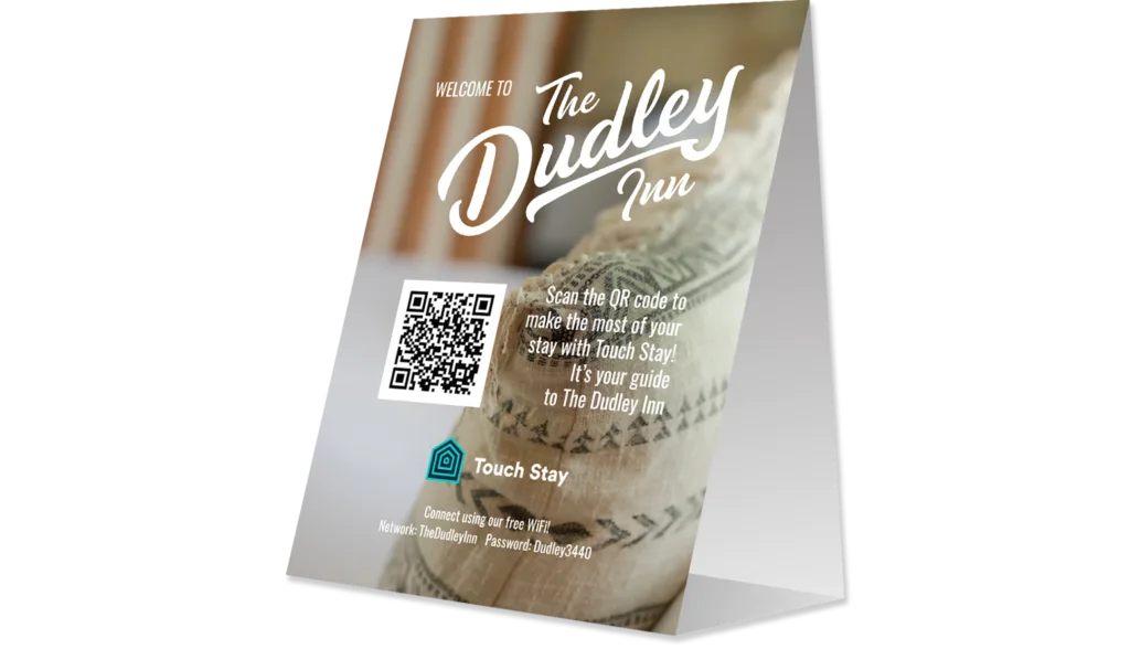
When staying at The Dudley Inn, guests have access to in-room promotion allowing them to make the most of their stay in Muskoka. Tent cards allow guests to easily connect to the WiFi, and feature a QR code by Touch Stay take users to a site that shines a spotlight on local attractions and popular establishments in the area.

Brand Guide
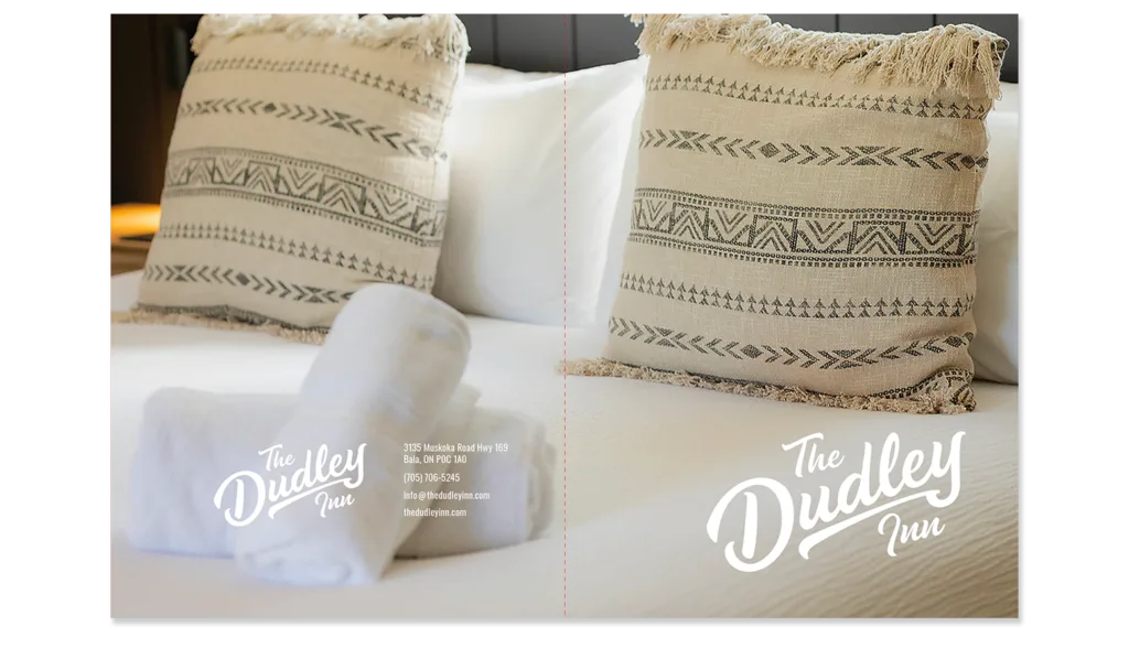
Brand Guides can be very complex documents, or they can be quite simple to allow for more flexibility. The Dudley Inn required only the latter, so an easy-to-digest single page brand guide was designed outlining the logo styles and colours, the colour palette, the typography, and some use case examples of the brand in situ.