Case Study



Primary Logos
Pace Solutions operates in North and Central America, and covers four different areas of water treatment.
Canada focuses on water treatment, energy efficiency, cleaning & disinfecting, and disease control. The focus of Pace Plant Health Advocates in the US and Central America is industrial agriculture and horticulture.
The multicoloured plus sign logo mark not only visually represents the ‘assistance’ concept applicable to each of these divisions, but also brings to life the company’s mission of helping customers achieve their conservation and environmental sustainability goals.




Secondary Logos
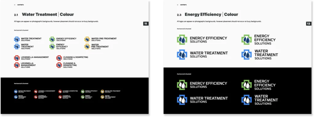
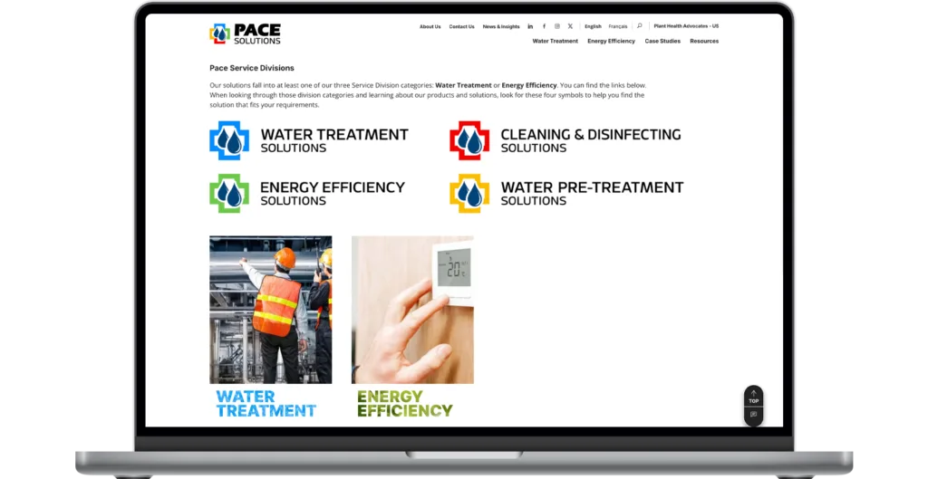
Water Treatment, Energy Efficiency, Cleaning & Disinfecting, and Water Pre-Treatment are the four main areas of expertise Pace Solutions brings to the table. These logos are featured in all marketing material related to these areas.

Program Logos & Certificates
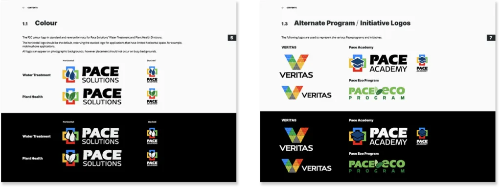
Pace Solutions is guided by the core tenet VERITAS, or truth. They turned the word into an acronym representing Values, Education, Respect, Integrity, Teamwork, Accountability, and Safety.
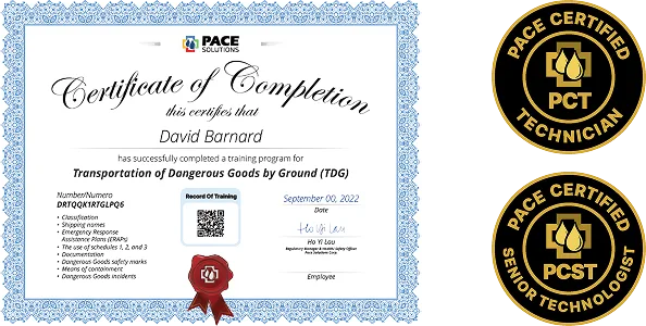
Pace also offers its teams internal development initiatives, continuous technical education, and professional certification programs designed to maintain industry leadership. Beyond specialized field expertise, internal employee programs emphasize ongoing safety compliance, hands-on mentorship, and skill advancement.
Guess what? They needed logo representation and certification material for all this cool stuff.



Digital
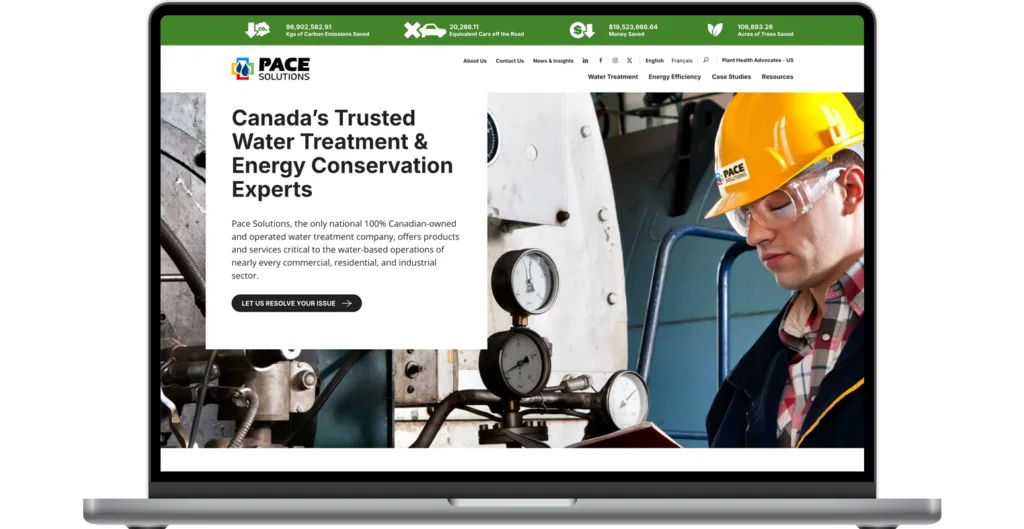
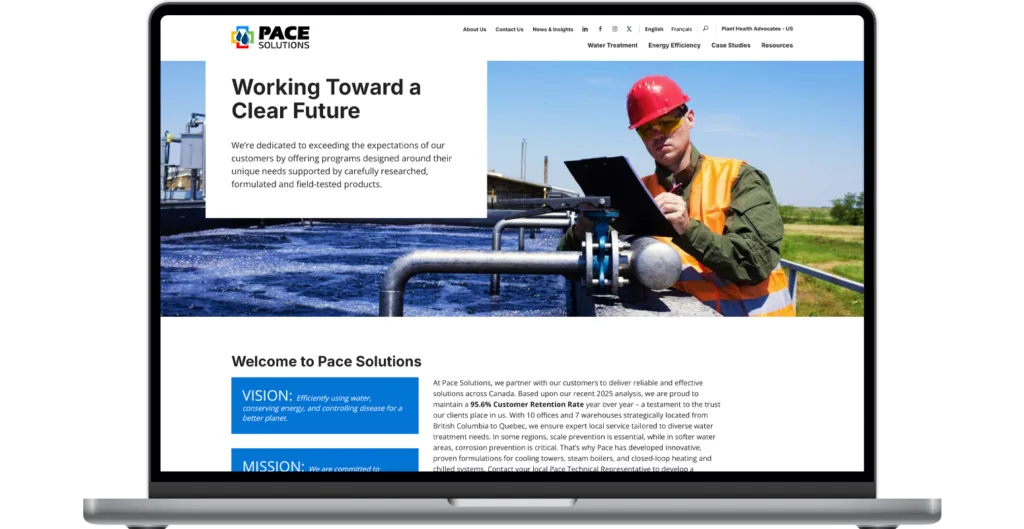
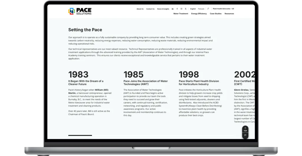
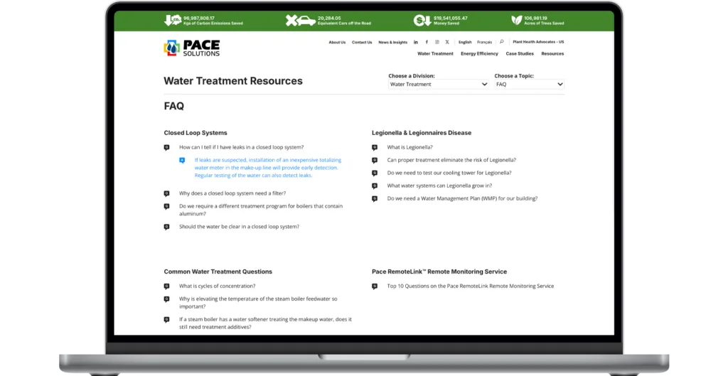
During the course of a 17-year relationship with Pace, I designed and built all four of the websites for their Canadian market.
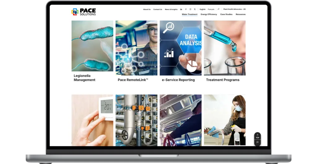
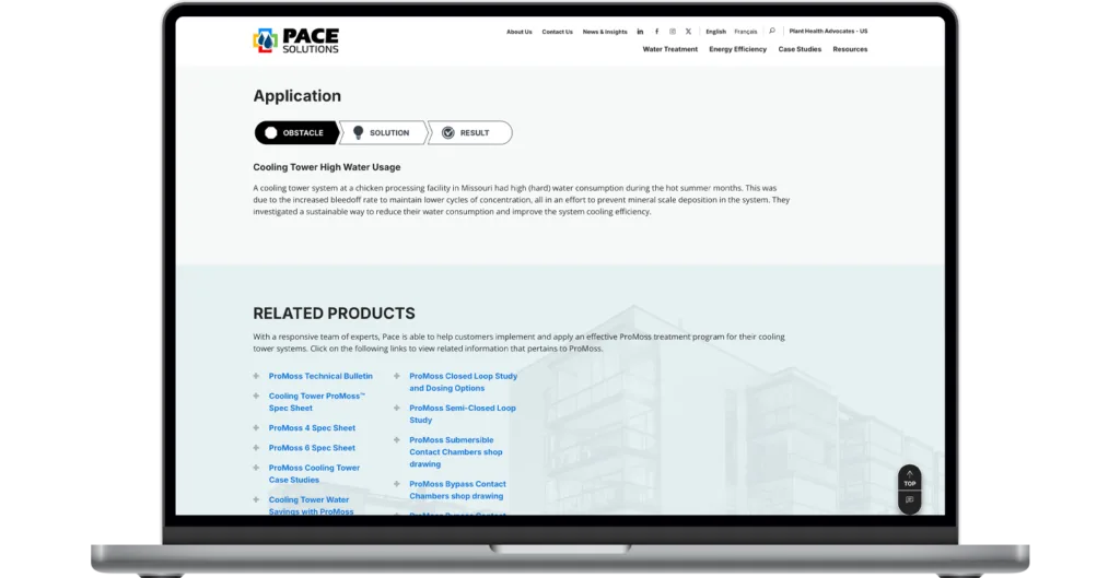
The current Pace Solutions website was built to stand out in their industry by presenting visitors with a consistent brand journey and easily navigable user flow
There are live counters, slick dropdown menus, and mini case studies for every service and product. Each element is unique and deliberate. aimed at enhancing customer discovery and encouraging contact.
The SEO efforts allowed Pace to analyze how its users interacted with their websites, then tailor their marketing efforts based on this data. Ongoing site optimization efforts ensured the code behind the website was always healthy and up to date.
Additional digital work included social media branding packages and post templates, and various landing pages.

Pace Journal
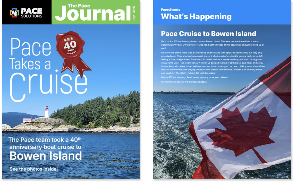
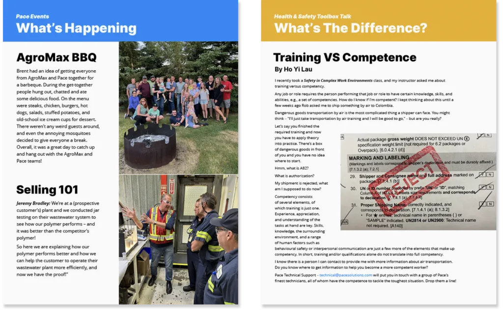
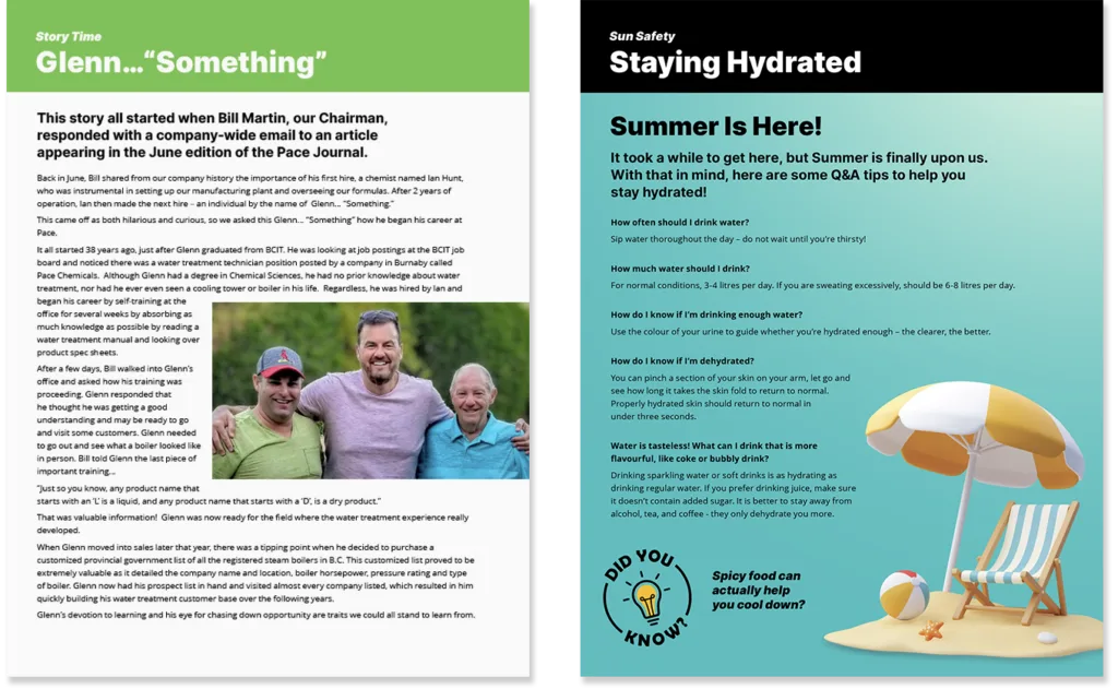
MayThe Pace Journal was a digital-only magazine comprised of articles written by several staff members. I would also do some writing based on ideas provided in bullet points. It was circulated internally to the Pace team on a monthly basis.
The goal of the Pace Journal was to provide a light-hearted and friendly snapshot of various goings on at the company. Articles would feature topics like spotlights on an office or team member, welcoming new people, safety tips, and general Pace product and service knowledge.
Pictured is the June 2025 issue.

Print Marketing
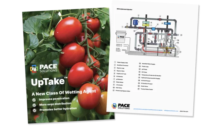
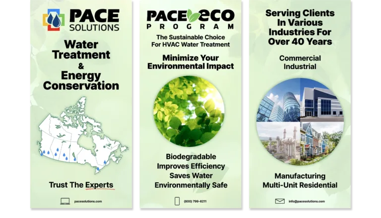
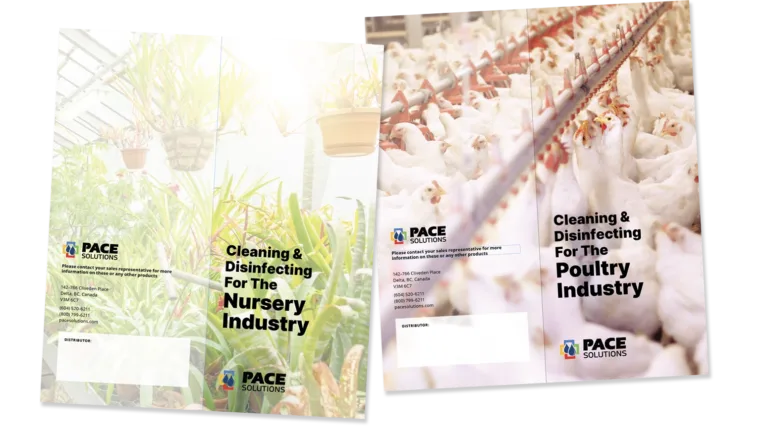
These designs, used to support a nationwide sales team, a busy trade show schedule, and a network of distributors,Z seamlessly covered print and digital, incorporated custom iconography and detailed infographics to deliver complex information in an engaging, concise format. The scope of print work also included quarterly ad campaigns designed for third-party industry publications.
Not pictured here are the many pieces designed for internal use having to do with safety protocols, mission statements, on-site evacuation plans for each office, , and label design for the over 100 Pace product offerings—often in English, French, and/or Spanish.
Infographics & Iconography
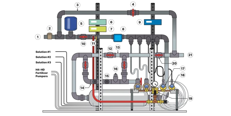
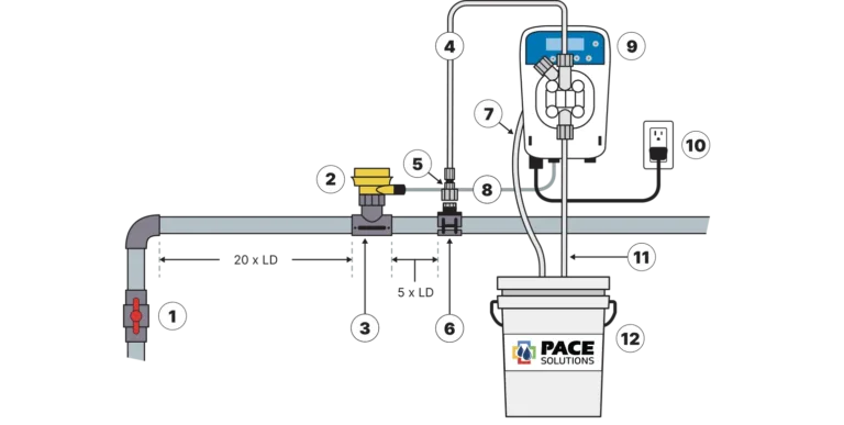
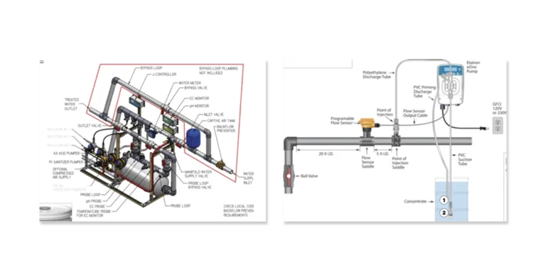
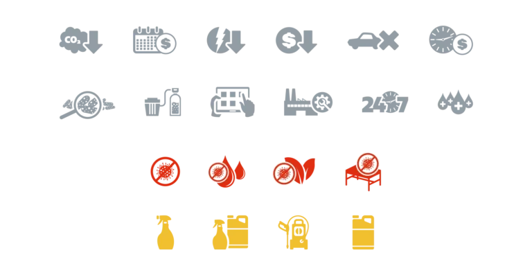
These infographics and custom icon sets were designed to take complex information and translate it into single easy to understand graphics. They turn Pace’s complex technical processes, stats, or service frameworks into clear messaging. Together, they get the Pace Solutions message across quickly and easily.
Pictured below are slides featuring two infographics, the client-supplied source imagery for both, and a selection of the icon sets I produced.
Brand Guide
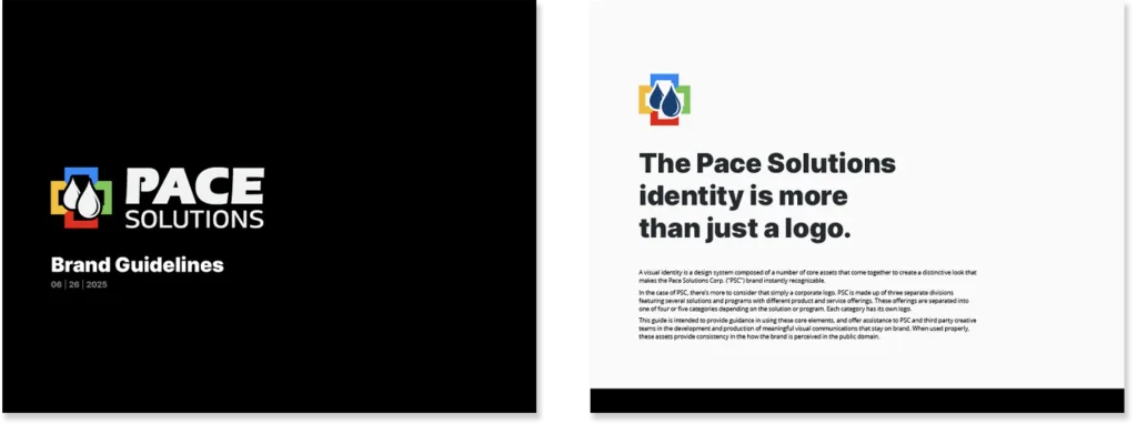
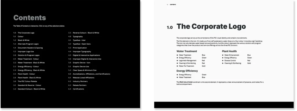
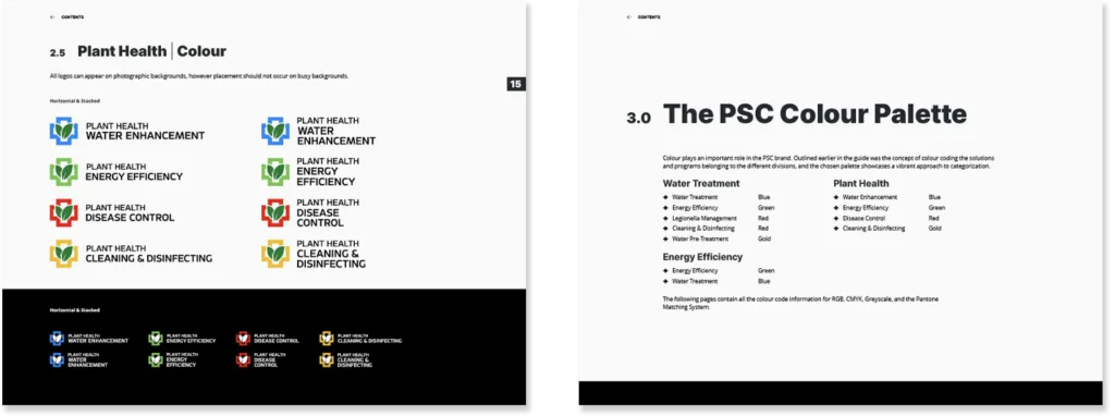
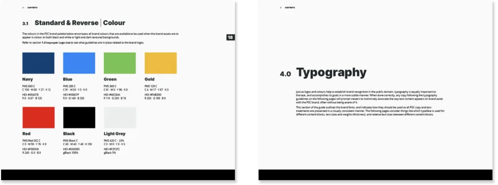
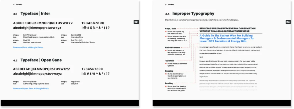
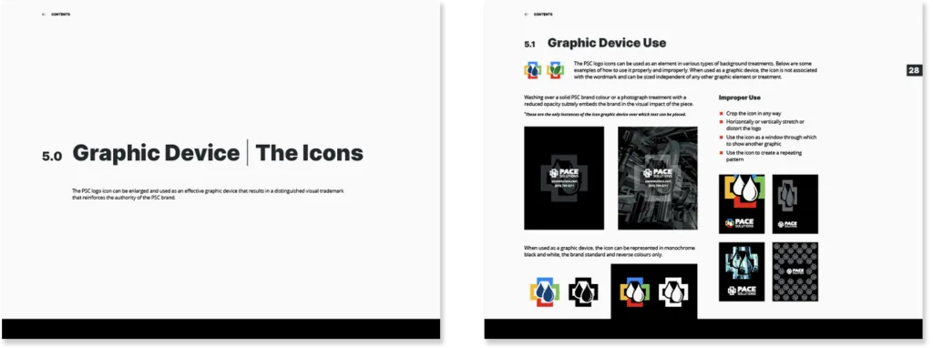
The Pace Solutions Brand obviously isn’t just a logo. It’s made up of everything you see on this page (and more if you can believe that). In order to maintain the consistency of this national brand a comprehensive, 34-page brand guide was designed. It features an interactive table of contents, the Pace logos, colour palettes, typography, spacing, and all the rules outlining proper and improper use of these elements.
Not all of the 34 pages are pictured.