Case Study



Beverage Packaging
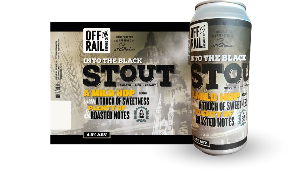
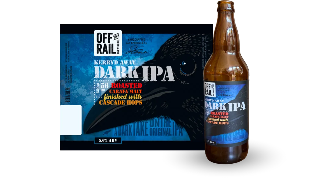
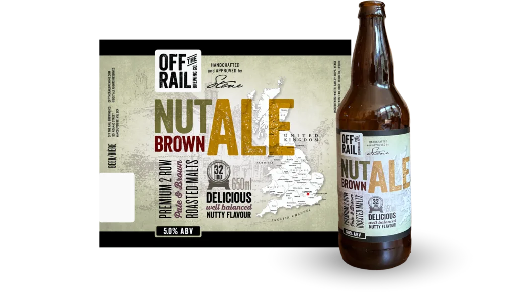
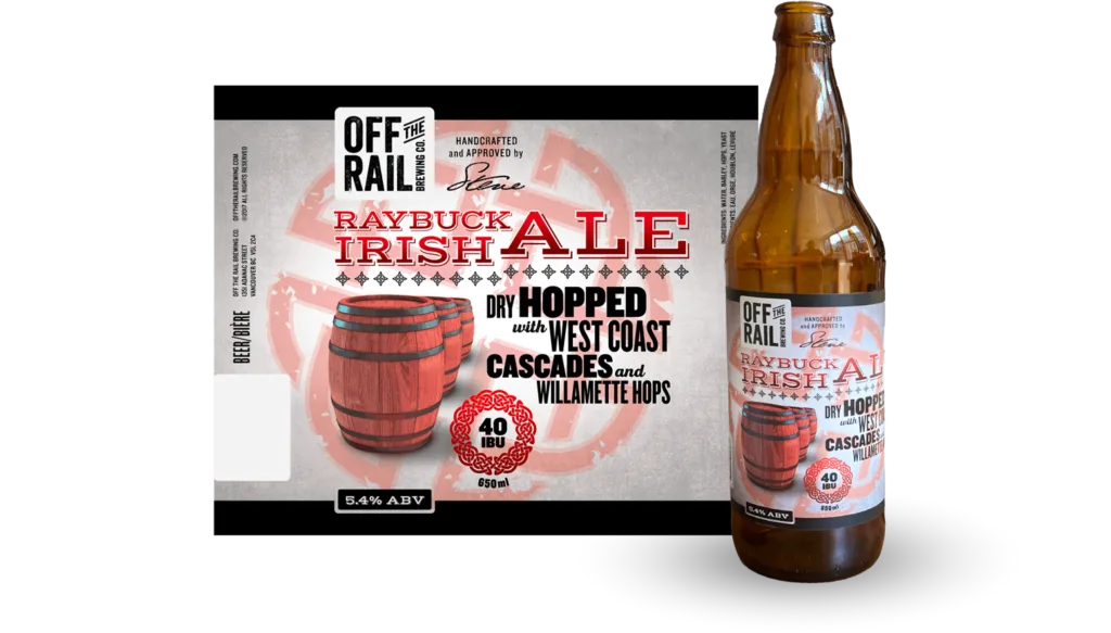
The idea here was to create an autumn motif, but to stay away from clichéd imagery of leaves, trees, pumpkins, etc. Off The Rail and I landed on certain keywords, which translated to imagery and symbols invoking darkness and timelessness. These images, combined with contemporary typography treatments in warm, autumnal colours looked as natural as could be on the shelves at local retailers.
Shown are the labels for the 650ml bomber bottles. Designs were also produced for the 473ml cans.

Beverage Packaging
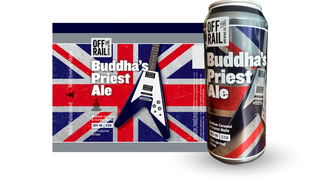
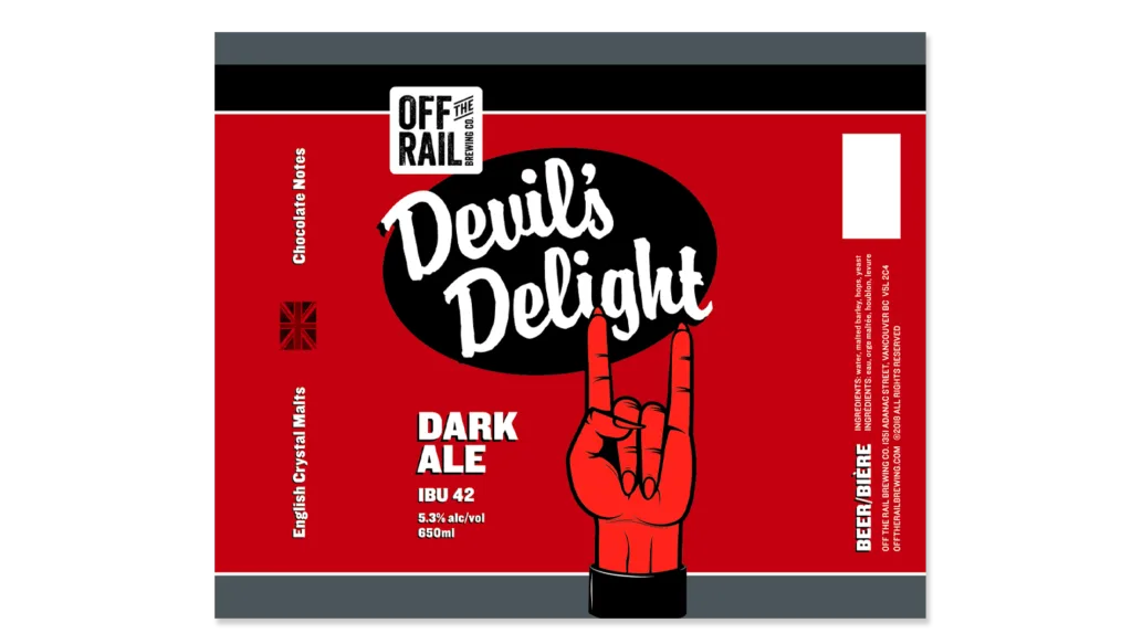
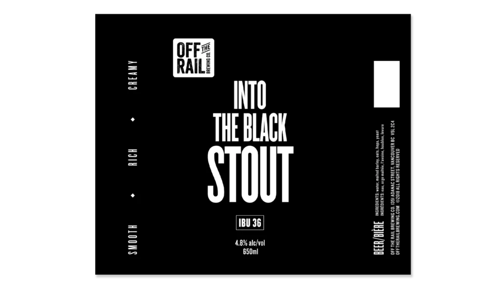
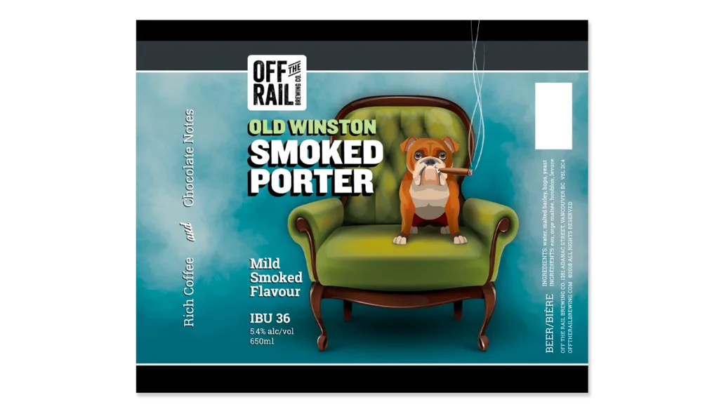
The second season saw a shift in the direction of the fall seasonal beer labels. The idea was to maintain the dark theme from the first season I designed the year before, but to get a bit more playful both in the naming of the brews and the label designs. Off The Rail and I decided on specific palettes and symbol-driven imagery.
Shown are the labels for the 650ml bomber bottles. Designs were also produced for the 473ml cans.